1 9
1 9
Pantone says the “courageous presence” of its new blue-violet shade “encourages personal inventiveness and creativity.”
Your registration site, app graphics, invitations, signage, and other printed materials are some of the first opportunities you have to set the meeting theme and color palette.
One of the easiest ways to change the feel of your meeting is through your lighting choices. Start with the outdoor space as people arrive.
The stage lighting, gobos, and table spotlights are another easy way to create the color story for your events.
A Very Peri berry cake? Never be shy about talking to the chef about the goals and themes of your event.
If you’re going to use flowers, don’t miss the opportunity to highlight your color theme with some stunning blooms.
Your attendees have been to plenty of white-themed events. With some lead time, they might enjoy dressing in Very Peri (or something close).
Talk to your hotel or décor company about which color themes they can carry through your event. You never know what's available until you ask.
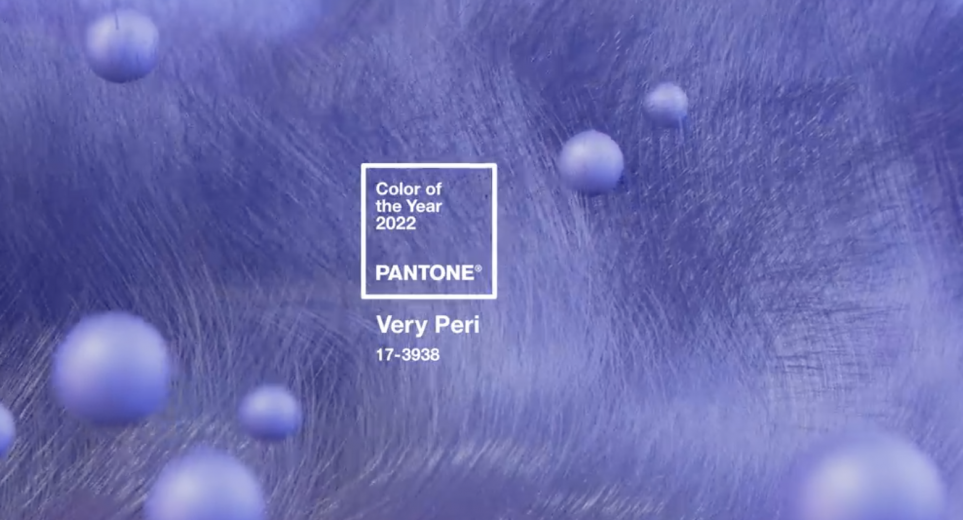
Consider this from the Pantone color experts: "We are living in transformative times. PANTONE 17-3938 Very Peri is a symbol of the global zeitgeist of the moment and the transition we are going through. As we emerge from an intense period of isolation, our notions and standards are changing, and our physical and digital lives have merged in new ways. Digital design helps us to stretch the limits of reality, opening the door to a dynamic virtual world where we can explore and create new color possibilities." To learn more about the choice of Veri Peri as the Color of the Year, visit the Pantone website.
![](https://www.meetingsnet.com/sites/meetingsnet.com/files/styles/gal_landscape_main_2_standard/public/Screen%20Shot%202022-01-19%20at%203.30.35%20PM.png?itok=3pp44xgZ)