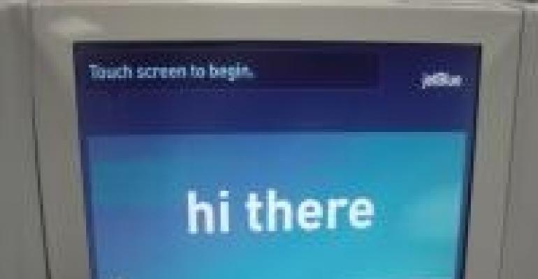
Having just flown my first cross-country trip on Jet Blue, I have to say I'm a convert. It's not just the leg room (OK, it's mostly the leg room), but it's also how they treat their customers: Friendly and respectful. It's hard to get both these days. So when I ran across this post on Good Experience, it really struck home. Check out these two airline kiosks:


Jet Blue's would be the simple, easy, friendly "Hi There" interface. The other, with "Self-Service Check-In", "Check-in now available for domestic and INTERNATIONAL flights.", "Check-In Without Bags (carry-on only)", "Lost Boarding Pass? Reprint Boarding Pass(es)," would be American.
Now go take a look at your meeting registration site. Does it look more like Jet Blue's or American's? You are setting the tone for the experience right there at the start, and believe me, attendees do notice.

