This article was originally published in our sister brand, BizBash.
A strong visual identity does more than just make an event look good—it creates an environment that fosters connection, generates lasting memories, and reinforces a brand's key messaging and values. But developing a cohesive visual identity involves more than choosing colors; it requires a strategic approach to design that resonates with your audience.
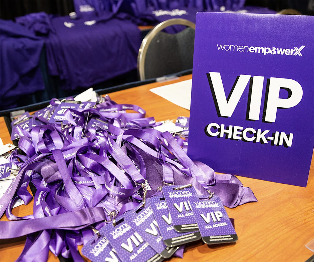
“Your visual identity tells the story of your brand,” explains Alexa Carlin, founder of marketing agency A.Rose Media and the Women Empower business conference. “It conveys your brand’s values, personality, and mission without words. For example, bright, playful colors might suggest a fun, youthful brand, while muted, elegant tones might communicate sophistication and luxury.”
Carlin points out that the first interaction a potential customer has with your brand is often visual. “A cohesive and appealing visual identity can make a positive first impression, encouraging further engagement.”
So, what exactly goes into an event’s visual identity? In short, it’s all about the colors, shapes, fonts, and other design elements that appear throughout the event.
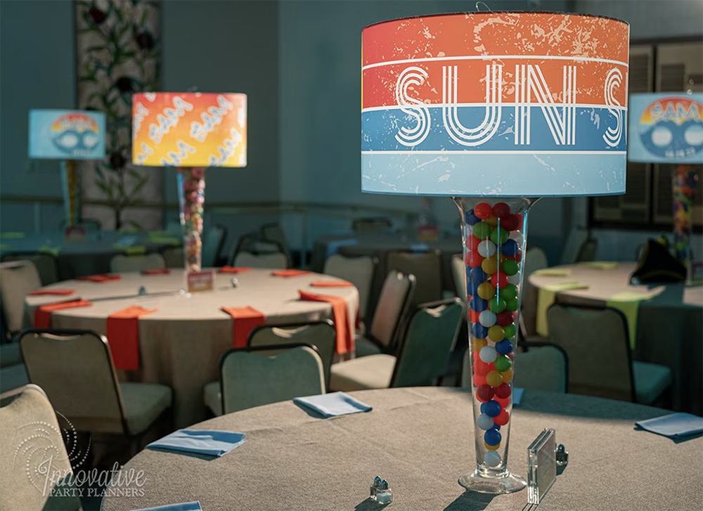
 “There are so many touchpoints to imprint your brand on at events,” says Heidi Hiller, CEO and creative director of Innovative Party Planners—who has a background in graphic design and always emphasizes the role of branding to her clients. “With the advances in printing and the incredible number of substrates, materials, types of inks, and endless surfaces, you can brand just about anything.”
Here are some basic elements to keep in mind:
Logo Design: “Your logo is the cornerstone of your visual identity,” says Carlin. “It should be simple, versatile, and reflective of your brand’s essence.” Incorporate your logo across all materials, from invitations to on-site signage.
Color Palette: “Choose a color palette that evokes the desired emotions and aligns with your brand personality,” says Carlin. “Consistent use of these colors across all media reinforces brand recognition.”
Typography: Whether it’s in printed programs or nametags, wayfinding elements, window decals, floor vinyls, or something else, the fonts you choose can also reinforce an event’s overall look and feel. “Select fonts that are legible and suitable for your brand’s tone,” says Carlin. “Consistent typography use enhances the cohesiveness of your visual identity.”
Imagery and Graphics: “Use images and graphics that support your brand message,” she adds. “Consistent style and quality in photography and illustrations maintain visual harmony.”
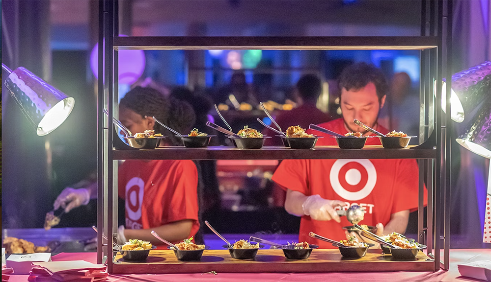
Branded Apparel: “Another great way to create a strong visual identity is having custom clothing made for the staff,” notes Hiller. “Think bow ties, ties, scarves, socks, hats, logos on shirts, printed fabric, embroidered jackets, and more; branded apparel worn by your staff can help your attendees identify your team.”
So, how exactly do you establish an effective visual identity? Here's where to start:
1. Clearly define your brand and your goals.
“Before you start designing, have a clear understanding of your brand’s values, mission, and target audience,” suggests Carlin. “This will guide your design choices and ensure they are aligned with your brand’s message.”
Sergey Taver, director of marketing at Precision Watches, agrees. “Define a clear brand story and stick to it,” he says. “At a recent luxury watch showcase, we centered the event’s visual identity around the brand’s heritage and craftsmanship. We used elegant, timeless fonts and a muted color palette that echoed the sophistication of our watches. This cohesive narrative was reflected in all event materials, creating a unified and memorable experience.” 
2. Do market research and create a mood board or design deck.
A good starting point is thinking about a brand’s existing visual elements, if applicable—including logos, go-to colors, textures, and other graphic elements—in an event setting. “Analyze your competitors and market trends,” adds Carlin. “Understanding the visual strategies of successful brands in your industry can provide insights and inspiration.”
From there, use mood boards to visualize and refine concepts, suggests Taver. “For our annual gala, mood boards played a crucial role. We combined elements like velvet textures, gold accents, and Art Deco patterns to create a glamorous, cohesive theme. Sharing these boards with our team ensured everyone was aligned on the vision, which led to a stunningly consistent visual presentation.”
3. Work with an expert.
“Just stamping and repeating the same visual everywhere is not the way to go,” says Hiller. “Hire an experienced brand-marketing graphics company or event-experience designer to create alternative ways to take your brand to another level.”
4. Avoid mixed messages.
"A cohesive event visual identity ensures consistency across all touchpoints, from invitations to photo backgrounds,” says Dan Wilson, vice president of marketing for Roland DGA, a commercial print provider that has created signage for major events like the Heisman Trophy ceremony and Adobe MAX. “It's important to consider aesthetics and the message and themes you want to convey."
“A strong and consistent visual identity helps in establishing trust with your audience,” agrees Carlin. “When your visual elements (logos, colors, fonts) are uniform across all platforms and materials, it creates a professional image that customers recognize and trust.”
9 5. Prioritize scalability and versatility.
“During our latest product launch, we ensured all design elements were adaptable across various platforms,” remembers Taver. “The logo, typography, and color scheme were designed to look impeccable on everything from large banners to social-media posts. This approach maintained a strong visual identity, regardless of where attendees encountered our branding.”
“Low-resolution images or poor design can negatively impact your brand’s perception," agrees Carlin.
6. Keep it simple—but don’t be afraid of some surprises.
Stay away from overly complex designs, suggests Carlin. “A cluttered visual identity can be overwhelming and hard to remember. Aim for simplicity and clarity," she says.
But don't be afraid to shake it up! “Include surprises by introducing a variety of design elements,” says Hiller. “I have often referred to this as deconstructing the logo or brand and reinventing it, much like a great chef might deconstruct an ordinary recipe and reinvent a completely new way of creating it.”
7. Develop a strong relationship with a local print provider.
"For event professionals, having a reliable local print partner can significantly enhance the execution of your event's visual identity,” points out Wilson. “They can provide quick turnaround times, ensure color accuracy, and offer valuable insights into the best materials and techniques for your needs. This partnership allows event planners to be more flexible and responsive to last-minute changes, ensuring a seamless and polished final product."


