In 2009 my wife, Nicole, and I started 360iDev, the first iOS developer conference. We designed it to be a community where creativity and innovation would thrive. Currently, the annual event, held in September under the umbrella of 360|Conferences, draws more than 300 participants.

John and Nicole Wilker created the 360iDev developer conference
We loved the idea of providing an open environment for people to gain knowledge, find inspiration, and make lasting connections. But we didn’t love the printing of event schedules, session agendas, and surveys that we’d been used to doing for our existing events. We would collect thousands of sheets of paper and manual enter survey and attendee information into a database. These piles of paper were not compelling either to attendees or to the internal team.
So for our new, mobile-focused event (attendees develop products for iPhones and iPads), the logical solution was to eliminate the paper and build a mobile app. Mobile, we thought, would help streamline event processes and organize logistical details so attendees could focus on experiencing the event and meeting like-minded participants. A mobile app would also be the perfect solution for “going green.”
Our goals seemed straightforward enough: enhance the conference, simplify planning, and boost attendee engagement. But our search for the perfect app was anything but straightforward. So for those planning to implement a mobile strategy for an upcoming event, we hope you can learn from our experiences!
App #1: DIY = Failure to Launch
Our first thought was to do it ourselves.
Built by our in-house development team, our first app was Flex- and Coldfusion-based. The fact that you don’t know what that means gives you an idea of why this app failed to take off! They are two Adobe Web-application development platforms used by programmers, and during the two years we used it, this event app retained a developer-based interface that lacked the polish of consumer-facing apps.
Other downsides: Updating information was so labor intensive that it negated the benefit of moving to a mobile application in the first place. The search continued for something more user-friendly.
App #2: By Developers, For Developers = Still User-unfriendly
Next we moved on to an app built by a member of the developer community.
Though this app was cleaner than the first one, it was still too barebones, lacking the features and capabilities we needed. And, because the app was built by a developer for developers, it came up short in the user-friendliness department—in particular for us, as administrators.
A primary reason for moving to mobile was to easily keep our guests updated throughout the event. Schedules printed weeks in advance inevitably have missing or altered information by the time event day rolls around. We were thirsting for an app that provided real-time updates, but this one wasn’t doing the job.
For one, the app had no “backend.” Without direct database access and a standard FTP (file transfer protocol), uploading and updating information was a hassle. Our event planners struggled with complicated XML files whenever they wanted to send updates. And without push notifications, the only way for attendees to receive the updates was to close and restart the app all over again. For certain event details, the developer himself had to go into the app to make changes. The whole process was tedious and disorganized.
Despite adding updates and features, the inconvenience proved too much. We needed to move on.
App #3: Off the Shelf = Incompatible
One of our vendors had created a conference app called ChaiOne Events that was available in the app store. So that was where we turned next.
Unfortunately, it was another fail. The biggest problem was the multi-events environment, which meant our attendees had to comb through dozens of irrelevant events to find ours. There were no customization options, and the colors of the app clashed with our logo.
Worse, ChaiOne still didn’t solve the major problem we’d experienced with our previous two tries—making real-time updates. Populating schedules and making changes involved a complex and inefficient process using Google Calendars.
We had also hoped that a mobile app would make our data-collection process easier while saving paper. As all event planners know, attendee feedback from surveys is important for future analysis. However, this app had no way for us to send surveys and collect data. We scrapped it.
App #4: The Right Bells and Whistles
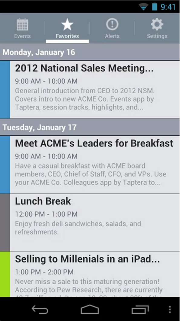
In 2012, a member of the iOS community introduced us to app developer Taptera. Our teams hit it off, and things started looking up. The Taptera Events app is user-friendly and customized with the 360iDev brand colors and logos integrated into the design theme. Another plus is that we are not one event among many in the app, and our guests can keep the app on their phones to be used year after year.
To send updates, our events team easily logs into the backend and can make last-minute changes, which are then sent out to attendees in real time via push notifications.
We also found features that we didn’t even know we needed. For example, a news blast feature allows us to send morning news items so attendees never miss a beat. And social integration means attendees can connect with each other directly on social networks via the app.

A sample screen from the 360iDev conference app,
built with Taptera
Our survey problem was solved with a built-in survey feature that made it easy to collect surveys, session feedback, and attendee information. After the first event using Taptera, we received several thousand session ratings when in the past we only saw a few hundred session ratings. The app made it easy to track what people liked and helped us figure out what sessions need to be improved for the next event.
It is clear that attendees love the app too. Favorite features include the ability to build custom schedules and rate sessions, along with the screen design, which is straightforward and streamlined for mobile devices. In 2013, we had an 85 percent download rate.
To ensure our guests downloaded the app, e-mail reminders were sent in the weeks prior to the event with an activation link. Those who forgot were reminded about the app on the day of the event, since we no longer provided print materials.
We also found the app useful for post-event activities, such as promotions and reminders to take the survey.
The course to finding the perfect app revealed a lot about us as well as our community, and we found that turning a good event great required teamwork, patience, and courage to try different strategies.
A Q&A with John Wilker
Q: If you had it to do over, how would you go about searching for an appropriate mobile event app?
A: If we were to go through this process now, I’d make a list of the things I need, want, and would love to have, and see who could meet our requirements. There’s no shortage of folks who can develop event apps so it’d definitely be a “who can deliver most pieces of the list” scenario.
Q: What did your experience teach you about mobile event app costs?
A: Our first apps were in-house/attendee-created largely due to cost. Or lack thereof. We’re bootstrapped, so we didn’t have actual capital to invest in getting an app created, but we did have time and data and such that we could make available.
But it’s very much “you get what you pay for.” Our first apps were virtually free, but, well, sucked. Taptera struck the right balance of cost per attendee and features. When it came time to make the jump, budgeting for the app was a no-brainer.
Q: Have you incorporated any sponsorship/revenue opportunities?
A: We offer an “app sponsorship” level in which the company gets a sponsor logo incorporated with the conference banner in-app. We also offer rotating sponsor ads in the app for certain levels of conference sponsorship.


