You know when you keep coming across a topic and it makes you think the universe really is trying to tell you something? I recently ran across a couple of posts that talk a lot about walls—not a topic that generally comes up all that often on my RSS feeds. While the one on how to make your apartment more presentable has some cool ideas, it isn't directly relevant (except I'd love to steal the idea of painting a big area with chalkboard paint and providing buckets of chalk for people to use, either as a themed wall like Meeting Professionals International did with its "before I die" and "what I'd like to see at World Education Congress 2014" boards), but the other, on making the most of office space, had lots that meeting planners can chew on.
In that one, Dr. Marla Gottschalk, an industrial and organizational psychologist who analyzes how workspaces can influence behavior, says, "An often overlooked driver of organizational change—our visual surroundings can energize us to become more creative, innovative and engaged." I went to an interesting session by Troy Halsey, author of The Freelancer's Guide to Corporate Event Design, at MPI WEC13 that covered some similar ground, especially in how important it is to consider all the senses when designing a meeting space. But it doesn't have to stop with lights and gobos when it comes to designing walls that build on the usual ballroom's gray walls. Those walls are designed to be blank slates, but so few meeting organizers ever fill them with much.
While Dr. Gottshchalk is talking specifically about office spaces, her three main headings apply to meeting spaces perfectly:
Matching the Environment with Tasks: Velvet Chainsaw Consulting's Jeff Hurt talks about this a lot, especially how room sets can work for or against what you're trying to get accomplished. Think about it also in terms of walls, both physical and otherwise, that are in your conference space. Do you use a raised dais and lectern that literally places your presenter above everyone else? Do you have different seating areas that create separate spaces for different types of work to be done? In the hallways and gathering spaces, how do you carve out spaces for intimate conversations, for checking e-mail and phone conversations that may require some privacy? Do they work, or do you find people avoiding or using these areas in ways other than you intended?
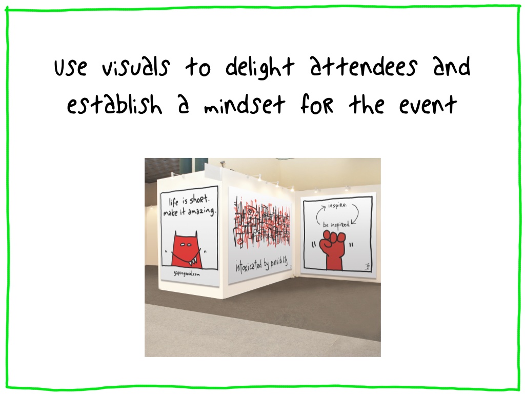
Tell a Workplace Story: Oh yeah, why not use your meeting space walls to tell your conference's story? She uses as an example Hugh MacLeod, whose company Gapingvoid is looking to bring art that matters to the business world to "affect change in business and business culture." And not just at the office. What can bringing art to a meeting do? Check this out (disclaimer: I'm a huge fan):
Curate Ideas: This is similar to what MPI did with its boards—give people places to write down their ideas, dreams, fears, hopes, whatever it is that your meeting is trying to inspire. It can be incredibly moving, and powerful.
So when is a wall not a wall? When it's a building block.


