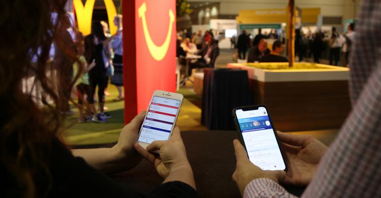
At the most recent EventTech conference for event marketers, held in mid-November in Las Vegas, the Experience Design & Technology Award for best event app featured formidable finalists from the tech world: Cisco Systems and Microsoft. But it was the third event finalist—fast-food giant McDonald’s and its app-development partner Kindle Communications—that walked away with the award. Alex Nuttall, associate partner and digital strategist for Kindle, notes the key element that won over the judges was simplicity of the app, with a bit of surprise mixed in.
First, the overarching philosophy for this year's event app was "to create an experience for franchisees that mirrors the customer experience McDonald’s wants them to deliver in their stores," Nuttall says. Interestingly, that experience comes in the form of significant personalization, but without too many choices that serve to slow down the decision-making process. So the design team took personalization as far as it could with the attendee data they had: how many previous events each franchisee attended, the districts they were from, the issues they were most interested in, how often they interacted with the event website beforehand, and about a dozen other data points that allowed them to conduct accurate filtering, provide relevant content layers, and make useful recommendations for each attendee.
By doing this, "we made the experience seamless to the end user because there weren't icons or menu items to personalize every feature—my agenda, my exhibitor list, etc.—that they had to choose from," Nuttall says. "The task of personalization should not be placed on the user in every section of the app, or you won't get high app usage. Instead, each home page, dashboard, and other section are personalized by our data to be directly relevant to each franchisee." What's more, the app presented opportunities for franchisees to connect in person with others who had common interests or backgrounds.
Another app element that was simplified yet still promoted interaction was a social-media stream that focused only on that one objective. "Basically, we took a page from Instagram's book and said to attendees, 'Don't make any posts without a photo,' while saying to our design team, 'Don't make comments and likes overly complex by making them shareable on outside social platforms,'" Nuttall says. "We just wanted information and action in the feed that really mattered for the event itself, so that people could feel the excitement of the whole show and see what they haven't experienced yet on the show floor. Basically, have everything in that social-media stream be quick to post and quick to browse."
Lastly, the app developers took a franchisee tradition—collecting pins and badges that are specific to each biennial convention—and allowed attendees to earn more of them for both in-app and in-person actions that they didn't even know would qualify them for pins and badges. "Giving people a list of tasks to do to earn rewards often does not promote deep interaction," Nuttall says. But because it is a point of pride for franchisees to come back to the show and display their pins and badges to show off their engagement with the event and the brand over the years, the app team moved that excitement into the digital realm. "If someone took an action that we wanted them to take, they earned a badge—but those actions were not publicized ahead of time," he notes. "So, the surprise factor pushed people to raise their engagement with the app and with other attendees to see what actions earned them badges. And the most popular areas of the app were in the social feed and in people's profiles, where the badges each person earned were listed."
For the 15,000 attendees of McDonald's April 2018 event—some decades-long veterans, others quite new to foodservice and/or franchising—the event app enhanced their event experience. It also garnered accolades from EventTech's team of judges. Nuttall's final lesson: "It's very easy to think more features in an app will deliver more engagement and a better app, but it's not true. The paralysis of choice is real. We gave people no more than three choices in almost every area of the app, and the result was much more engagement."


