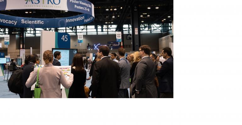
As the 2019 ASTRO Annual Meeting wrapped up at McCormick Place West in September, Johanna Vanarsdall, senior manager for scientific and educational programs, took stock of the event’s e-poster program and smiled. Over four days, nearly 1,800 e-posters were presented on 48 touch screens on each side of 24 back-to-back kiosks across 18,800 square feet of the main exhibit floor (see blueprint below).
Just two years before, Vanarsdall began moving the American Society for Radiation Oncology into the e-poster environment. Member surveys showed that 75 percent would prefer posters presented electronically rather than walk a paper-poster hall that was 100,000 square feet and away from the main exhibit hall, which convinced ASTRO’s board to approve the transition. At that point, the work began for Vanarsdall and her team.
 The Plan for Persuading Presenters: Communicate Early and Often
First, to get poster presenters to adapt to the electronic medium, Vanarsdall built an email campaign that delivered the right details at the right time. The first email went out five months ahead of the show, providing information about the on-site and post-show benefits of e-posters, the ease of touch-screen functionality, and abstract submission dates and fees. This information made it easier for ASTRO to impose a new digital-upload fee of $60 per e-poster. That fee increased to $70 and then $85 as the date moved closer to the final deadline two weeks ahead of the meeting. Offering an early-bird discount helped get more early submissions, making it easier for Vanarsdall to schedule multiple presentations on related specialties at the same stations. Grouping the e-posters gets attendees to stay for more presentations while educating fellow presenters too, as they are asked to arrive at their station at the start of each day’s 75-minute poster-review period rather than right before their own five-minute presentation. What’s more, “the networking became much better with so many people at each station for longer,” Vanarsdall says.
The second email, sent four months out, detailed the format that e-posters take plus the multimedia possibilities, and provided how-to demos and a Q&A section from the e-poster vendor. (See the presenter webpage here.)
The third email a month later gave tips on how to prepare oral presentations and provided images of the presentation areas and the screens to get presenters comfortable. And the final email 60 days out provided instruction on how to make late changes to presentations, check in at the presentation station, and leverage the on-site help desk. Only a few presenters asked for a dry run through their presentation with help-desk staff. Interestingly, because the greatest number of presenters were from China, Vanarsdall had to make sure the e-poster vendor provided customer-service phone reps leading up to the event who were available during business hours in different time zones.
Lessons Learned from Years One and Two
In order to maximize space, Vanarsdall used two oval layouts of 12 stations each, with each kiosk having two screens set back to back. “We had a few complaints about the sound not being great,” she notes. “We used that layout to make sure we could fit the poster sessions in the exhibit hall, so we had 24 feet between screens and about 20 people standing before each screen. But for 2020 we will use semi-circles rather than ovals, have only single screens at each station, and have consecutive stations alternate sides to resolve the sound issue. We will probably have to add another 75-minute session to accommodate all the posters, though.” One other alteration: The addition of soft seating on the sides of each station for people who can’t stand for 75 minutes.
 As for results, “more people were in the poster area frequently this year,” says Vanarsdall (pictured here). “People stayed for more presentations in each session, and once they realized they could come there outside of presentation hours and use any screen to see any session, the area was always full and it was a great place for people to meet up and network.” Also, the e-posters make for a great year-round marketing tool; ASTRO has a virtual library that retains posters for three years after an event.
In year one, the total cost was a bit more than $200,000 for e-poster vendor services; to rent screens, stations, a help desk and other furnishings; and to set up and tear down the space. However, the association got about half of that amount back from fee revenue and did not have to pay for an additional hall nor the poster boards and labor that goes with it. For the second year, 2019, “we had more submissions so revenue was a bit higher. It’s not a priority for us to break even on this—we just wanted something new and innovative, and to help presenters get the best audience they could. We estimate that 80 percent of presenters were very happy with the new system. But a society could estimate their costs and set up the fee structure to get close to breaking even.”
In the end, Vanarsdall says that the key to ASTRO’s success with e-posters was “communicating early, clearly, and in bite-size chunks with presenters.” In fact, “things went so smoothly when the e-poster hall first opened that we just we sort of stood there and marveled at how quiet the help desk was.”


